Welcome to my complete guide on writing course landing pages.
Want to see my first-ever online course landing page?
NEVER GOING TO HAPPEN.
I burned it because it was that terrible.
It wasn’t until I hired a real copywriter and designer with REAL copywriting experience that I actually started making sales.
Without the right online course page design and copywriting formula, you’ll be exactly like me a few years ago: stuck and wondering why the hell nobody likes your course.
There’s a ton of bad advice out there from GuRuZ. “Oh, just use a template from Teachable!”. “Your site doesn’t matter. It’s the content that matters”.
That’s totally wrong.
In this article, I’m going to share my high-converting landing page formula, the course platforms with the best landing pages, and some high-converting page examples to inspire you.
I’ll walk you step-by-step through each section and explain exactly what to do.
NOTE: I highly recommend you choose the right course platform BEFORE you start creating your page. The only regret I have with my course is choosing Teachable instead of Kartra or ThriveCart.
Their templates were terrible, checkout was a nightmare, and there were no helpful conversion optimization elements. After changing to a legit platform, my conversions almost 5x’d.
OK, ready?
Let’s go.
Wait – Read This First: Why Listen to Me, Anyway?
I can tell that not a single author ranking on page 1 for this key term has ever actually written a successful landing page. Most sound like they’re never made a site or run a business before.
I have.
My own landing pages are killing it. And the copywriter on my team writes sales pages like these for a living. You don’t have to be a genius to do this. Just follow this simple formula, and you’re 75% of the way there.
**deep breaths**
Had to get that off my chest. Sorry.
Moving along…
Course Landing Pages – The Bare Bones Basics
Every great course sales page contains the following elements at a bare minimum.
- A big descriptive headline
- Exactly what they’re getting and what the outcome will be
- Social proof (e.g., testimonials, videos, trust badges, etc.)
- A good story
- Benefits
- Future pacing (essentially, you showing the reader what their life will be like after the course)
- What’s in the course
- CTA
These are the key elements of any effective landing page for your course. If you miss any of them, you’re leaving out a key part of the customer decision journey, and hurting your conversion rates.
READ: You’re losing sales that you’d otherwise be getting (a.k.a., lighting money on fire).
That’s why I love Kartra. Their pages have the best conversion rates I’ve seen.
It’s one of the only course platforms with templates that have been tested for lead generation and conversions.
Just choose a template, plug in your copy, and you’re halfway there.
If you use a template from Teachable or something, you might as well quit now. Plus, your pages will be hooked into your all-in-one ecosystem, so you can measure analytics and make changes in a few clicks.
If you’re on a budget, ThriveCart is a lot cheaper, has great conversion optimization elements, and is super easy to get the hang of. You’ll just need to get a separate WordPress site up and running to host your page, but that takes no time at all.
Let’s cover the formula in more detail now.
Grab a coffee, strap into your chair, and close that YouTube tab NOW.
My Ultimate Course Landing Page Formula
I just want to reiterate that my course landing page formula has actually been tested several times on my personal marketing campaigns.
Time and again it has generated sales. I was making almost no sales with my first landing page (it didn’t help that my course platform – Teachable – sucked).
Now? $50,000+
The only difference was this page formula and a few good testimonials… and switching to Kartra.
A basic template will get you nowhere. Don’t waste your time.
Let’s do this…
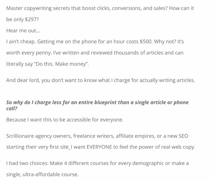
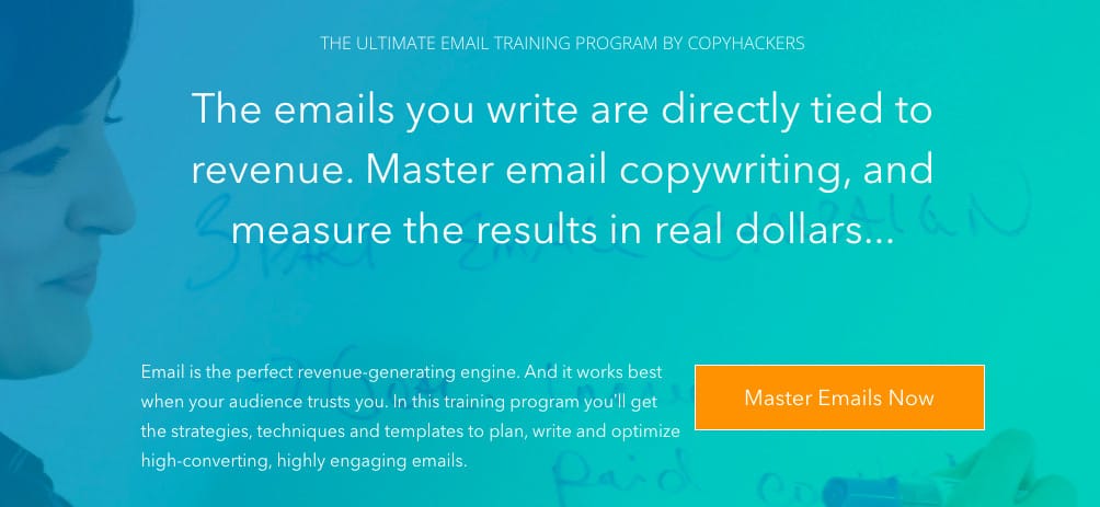
Section 1 – A Big, Beautiful, Descriptive Headline
I’ve got a fever. And the only cure is a big header that tells me what the benefit, process, and result of this course is going to be (and more cowbell). This is what I call a transformational headline.
Remember, most courses are TRANSFORMATIONAL.
Why do people take courses? To learn something. To master something. To become something or achieve something in their business or personal lives.
This requires transformation. The visitors to your site want to become something new. Show them you can help them achieve success and change their lives.
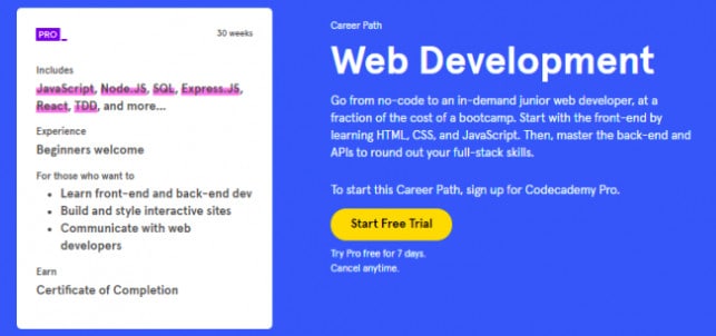
I love the headline above because it tells me exactly what the outcome of taking the course will be in detail. I can go from 0 to being employed as a web developer in this many steps (for cheap!).
This is killer. It’s a tour de force in making sales (and making me happy). Imagine being a visitor to this site and seeing a headline like “achieve web development career success or something – buy now”.
The words you use matter, my friend.
Don’t be afraid to write BIG HEADLINES. You can even add a smaller pre-headline above and a smaller subheadline below. Like this:

This big headline section covers all the bases. Who it’s for, what it is, the benefit of it, and why it’s so good (backed by real data). Visitors love this stuff.
Compare these big headlines to this small, non-descriptive one:

It’s not bad, but it leaves a lot to the imagination. In web copy, that’s a bad thing. What will I learn? Why should I trust you? Get more followers and build my brand? Meh, that’s a bit vague.
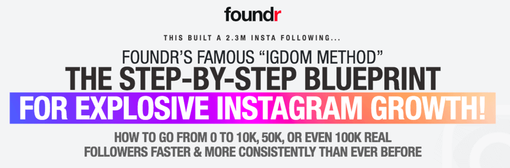
Now, look at how a real IG course landing page headline looks:
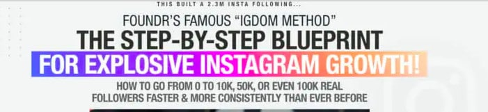
LORD HAVE MERCY!!!
Explosive growth is a bit spammy, but everything else is absolutely mint. Notice the detailed transformation here – 0 – 100k real followers. Also, notice the concrete proof up top – this built 2.3 million followers.
NOTE: If you don’t state exactly what your course is in your headline, it’s helpful to have ~50 words directly below saying exactly what it is. For example, (course) is a step-by-step blueprint to help you achieve (goal) via videos, hands-on instruction, homework, and professional certification.
If not, a visitor still may not know what exactly they’re getting.
Section 2 – Social Proof
Your next section needs to build trust and prove to the reader that your course works by showing awards, other companies you’ve worked with, or how many students you have. At the very least you should have some testimonials to build trust.
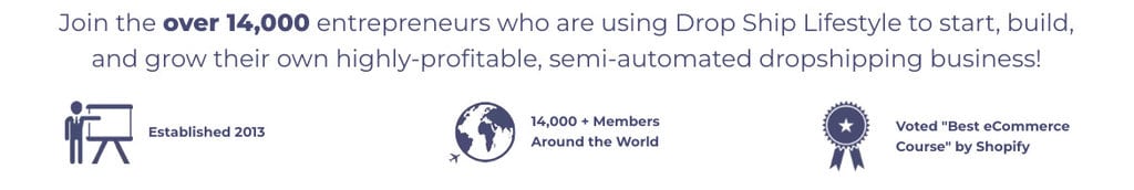
Dropship Lifestyle, the course that made Anton Kraly a millionaire, does this perfectly.
See above where he shows how many students he has, how long he’s been around, and his award for best eCom course from Shopify. Visitors immediately go hunting for this stuff. If you’ve helped thousands of people, prove it.
Since this is probably your first landing page, you may have to just have a few testimonials from happy students here. If you’re unsure how to get these things, check out my article on how to create an online course first.
TL;DR: Provide proof.
Section 3 – Your Story
Everyone loves a good story.
A great story immediately hooks a reader. It puts them in your shoes, proves you're human, and explains your transformation.
It shows the reader that what you’ve done is possible.
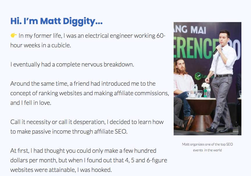
Matt Diggity, the man behind the course image you see above, does this to perfection. How do I know? Because this is a $1,000 course and after reading his story, I couldn’t help but click and buy.
Remember, it’s about your transformation:
- Set the scene by telling them who you were before
- Explain how you got into your field
- Show how you gained your expertise
- Prove your skills by explaining what you achieved
- Let them know that you’ve poured all of your hatred, malice, and evil into this course, and they can now learn everything you’ve ever mastered by following your advice
Stories convert. That’s a fact. Visitors want to buy from real human beings. Tell a good story on your landing page and you’ve got the reader hooked.
Section 4 – Problem -> Solution
Now that you’ve set up how awesome your course is, it’s time to twist the knife a bit.
Remind your audience of how difficult their situation is.
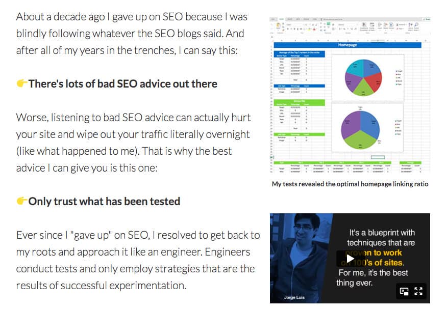
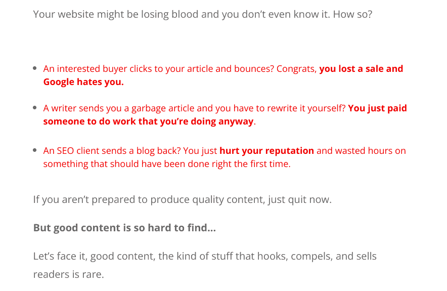
I really like how Matt goes on to explain how much bad SEO advice there is out there. Every new SEO entrepreneur moans about this.
Then, notice how he begins to tease the solution: only trust what’s been tested. The fact that he’s tested all of his techniques with real data is what makes his audience love him.
Here’s another great example from an SEO content course:
Remind your visitors that they are facing an impossible uphill battle, then show them that you have the solution.
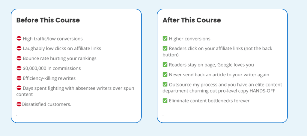
Here’s a life hack…
Visualize the problem and solution in a before-and-after chart. It’s a game-changer. It takes up almost no space and is super succinct, easy to digest, and very powerful. No explanation is even needed.
Check it out:
Section 5 – The Benefits of Taking Your Course (What Makes it Special?)
This might be the most difficult section to pull off.
Benefits are obviously one of the key ingredients in your landing page special sauce. But there are pretty much infinite ways to do it.
Benefits should be baked into every part of your landing page, so your traffic is constantly reminded that access to this knowledge will improve their lives.
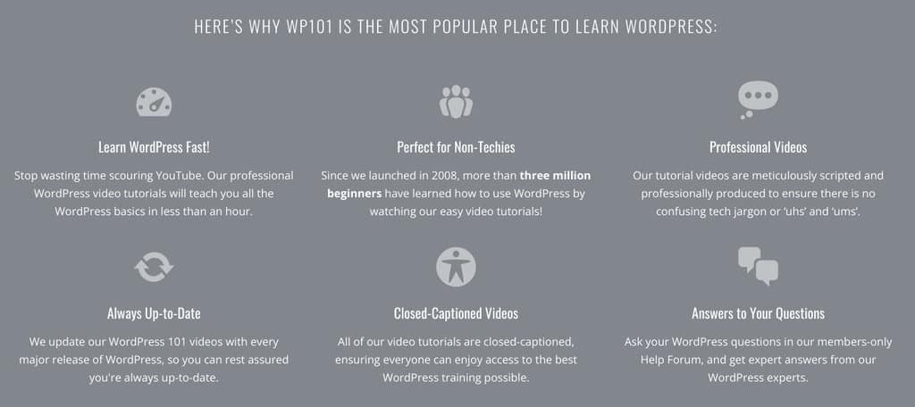
If this is your first online course landing page, then just go the easy route and make a separate section about the benefits of your course.
The picture above is a simple example from WP101, a WordPress development course. Not the best, but it’s a simple example that anyone can follow, especially if you’re new to course landing pages.
Remember, tell your visitor exactly what makes your course special.
Section 6 – More Proof by Showing Results
You can never have enough proof.
After you’ve created a benefits section, it’s time to show real results of real people who’ve changed their lives because of your course.
This is a bit different than testimonials or videos in that you should be showing screenshots of results, not necessarily people hyping you up. It can be both if you’ve got that type of proof, but just real numbers, case studies, or things of that nature will do.
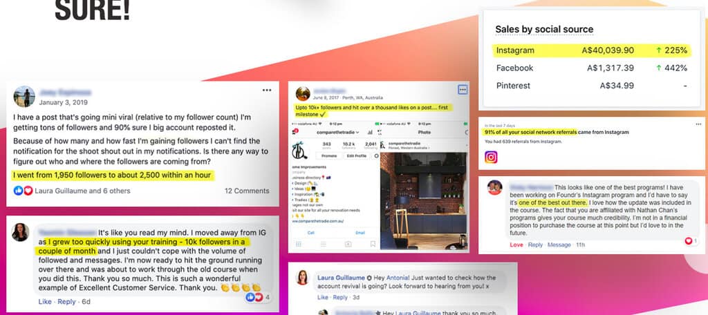
This example above is from the Foundr Instagram marketing course.
Here’s one last one to show you another cool way to do it. Show some students that have achieved the transformation that you guarantee with key details:

This is the most powerful type of proof there is.
Section 7 – A Sneak Peek
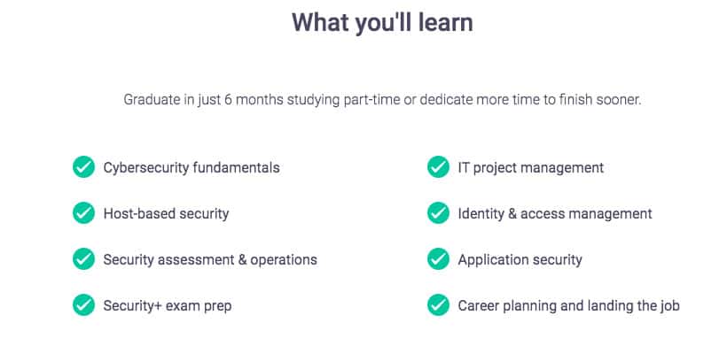
Springboard shows a super simple way to give a peek inside. Even the bare minimum is enough sometimes for effective landing pages. This is one of the biggest cybersecurity job training courses out there.
I prefer going more into detail like Foundr does for their IG marketing course:
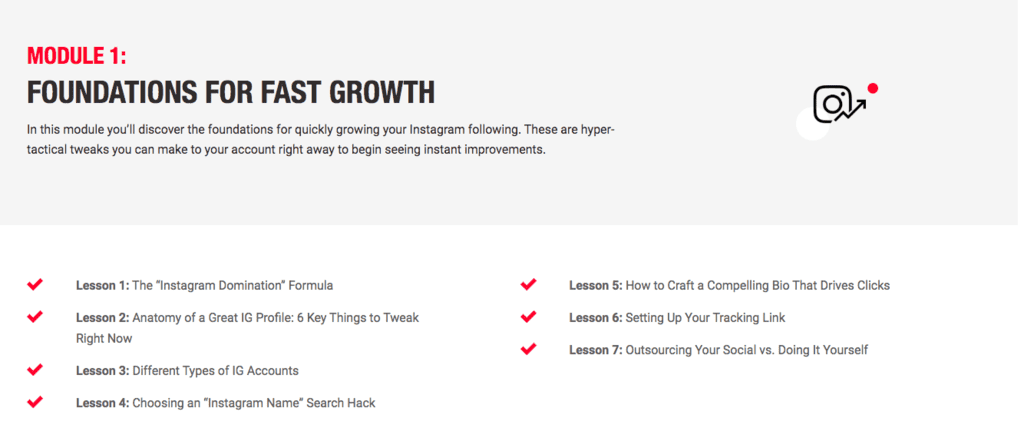
They list every module in detail for the visitor with solid headline copywriting.
By this point, the student not only knows what this course is and what it does, but they know that it works and are excited to get started. Show them all of the amazing skills they’re going to learn, then show how all this knowledge is going to change their lives.
Section 8 – Make Them an Offer They Can’t Refuse
You know what’s better than a regular call to action (CTA) on a landing page?
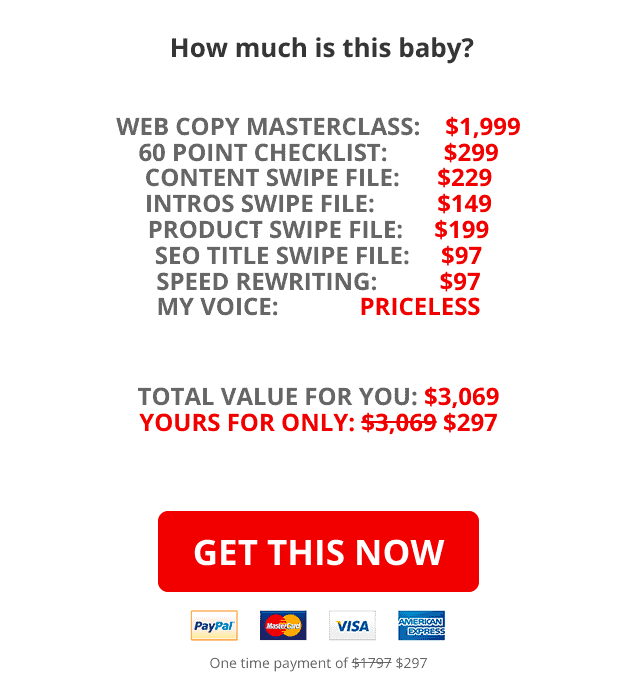
A landing page call to action that shows the reader that they’re saving money by purchasing this course. Don’t ask me why putting slash marks through prices works, but it just does.
Take your landing page CTAs to the next level by listing out the “real” value of the course plus all the bonuses (you should always offer bonuses). Once you’ve shown them how much everything is worth, put a big slash through it and show them the absurdly low new price that they’ll be paying today.
This is appealing both to the animal part of our brain (ohhhh, big savings! I love money) and to the logical part (well, this offer is amazing. I HAVE TO take it).
Section 9 – Address Objections
Customers are naturally super skeptical when they feel they’re being sold something. This is going to lead to people thinking of reasons not to buy your course. In copywriting, these are called objections.
It’s understandable. You basically keep hyping up your product repeatedly, so it’s natural for people to be like “eh, what’s the catch? Is this really as good as you say it is?”.
I recommend you create an entire section addressing the main objection for your first online course landing page and showing why it’s totally wrong.
Again, as you get better at copywriting, you can weave these counter-objection bits of copy into other sections around the website page.
For the time being a separate section on your landing page will do fine.
The important thing here in this section is to state the objection directly (e.g., I know you think this is too expensive, but hear me out). Once you address it, break down in detail why they’re wrong to think this.
Landing Page Bonus Ingredients
That covers all of the meat and potatoes of a great landing page (I really should charge for this). Even if you’ve created only what I’ve written above on your website, you can convert a visitor.
Those are the absolute must-haves for your first landing page. Once you’ve got some money rolling in and more confidence/knowledge, take it to the next level with conversion-boosting hacks.
-
Purchased Notifications
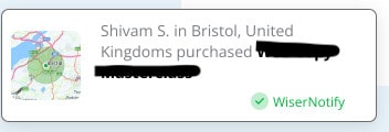
This is a conversion optimization super hack and one of the most important elements for boosting sales after you start bringing in visitors.
Use WiserNotify to show potential customers some students who have already purchased your course. These will continuously pop up as they scroll your landing page. Super easy hack that takes maybe 5 minutes to implement and gives a nice bump to conversions.
If you’ve got a decent amount of traffic coming to your site, I suggest you monitor conversions before and after implementing this for extra proof.
-
An “Appeal to Logic”
Great online course landing page copy should be rounded out by a final appeal to logic. That’s when you frame the purchasing decision as a simple choice between a logically painful option and a logically beneficial option.
Here’s an idea:
So, you have two choices: either continue what you’re doing now and never get a job, or pay $500 and get the career you want in less than 3 months, and totally change your life forever with a six-figure web dev position.
If it somehow doesn’t work, YOU GET YOUR MONEY BACK. This is a no-brainer, man. That’s why 1,000 students have already taken this course.
Really hard for any visitor to argue with this logic. And it’s actually true. Like, if you wanted a job like this, what logical reason do you now have NOT to buy this course?
-
Bonuses
Bonuses work. Plain and simple. It’s just the way the human mind is wired. If you want to take your conversions (and business) to the next level, add some bonuses to your website copy.
Show them that on top of your course, they’re going to get some killer bonuses worth hundreds or even thousands of dollars. This is the most effective use of extra assets you might have like ebooks, pdfs, worksheets, and other downloadables.
If your business is just getting started, you might want to even include 30 minutes of your personal time to entice more people to click that buy button. This sends a powerful message to potential students that you really care about their success.
-
An Email Capture Pop-Up
If you really want to generate leads and boost the ROI of your sales funnel, you’ll need a pop-up offering your students a downloadable in exchange for their email address.
The best course creators know you can generate more leads, make more sales, and grow an online business way faster when you focus on email marketing alongside your normal course.
Make sure the downloadable hit a key pain point and has a clear value proposition like “5 mistakes new developers make when looking for their first job”. Once you’ve got them in your email list, you can sell more courses, products, consultations, or whatever other lead generation ideas you have.
Trust me, it wasn’t until I started focusing on email marketing that I really started making serious money. Do it.
5 Killer Course Landing Page Examples to Learn From
Before creating your online course landing page, I highly recommend you do what all other intelligent entrepreneurs do: copy what’s working.
With that in mind, let’s cover 5 of my favorite course landing pages for inspiration.
I noticed that a lot of the articles ranking for this key term included some absolutely atrocious Udemy or Coursera landing pages claiming “beautiful web design” or “high praise for all the different elements”. That’s garbage.
Real copywriting and proper formatting are what makes the difference. Again, this is why Coursera, Udemy, Teachable, and other budget course platforms are a waste of time. Kartra, ThriveCart, or Kajabi are what real pros use.
Here are 5 awesome course landing pages with a great copy along with some key takeaways for you to use on your own pages.
Foundr’s has some awesome course content for IG marketing, and their landing page absolutely crushes it. Just look at it – proof, on proof, on more proof, on more proof.
Do this. Steal this strategy if you can. Write a big, beautiful, descriptive headline and follow it up with a ton of proof from happy students to build trust. That’s a sign of a course that works.
Notice how this is just full of video, after video, and video? You should ask every happy student for a video testimonial if you can.
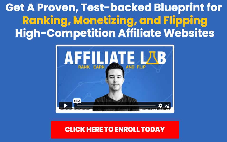
The Affiliate Lab is one of the most successful affiliate SEO courses ever made, and Matt’s landing page is an absolute tour de force in social proof just like Foundr’s course.
The headline is solid and he follows it up with a great video detailing exactly what the course is, the outcomes you’ll achieve, and how he made it.
He follows that up with a great story and a ton of video testimonials from happy students who’ve changed their lives with his teaching.
Take a look around. Notice anything? There’s nothing beautiful at all about this page. Beautiful landing pages are NOTHING without a good copy, visual elements, or storytelling.
Matt has everything from a great headline to proof, screenshots, and a “what’s in the box” preview of everything that’s in the course.
Not my favorite, but CopyHackers knows everything that needs to be on a successful click-through landing page – and it works. This is one of the best email courses out there.
The headline is massive with a ton of valuable information, proof, a buy button, and key details about what’s inside.
Then, they follow it up with proof, what’s inside, the benefits, and a great story.
Again, nothing pretty about this page. Just has great copy and formatting.

This SEO copywriting course landing page looks like it was built in 30 minutes, but the copy absolutely crushes it.
I sound like a broken record, but just skim this page for a bit and you’ll see all of my favorite click-through landing page elements again. The headline, testimonials, screenshots, story, before and after table – it’s all there.
This is pretty much the same formula I’ve given you above with some more advanced course landing page copywriting tricks. Steal this layout and formula for your pages, and you’ll be golden.
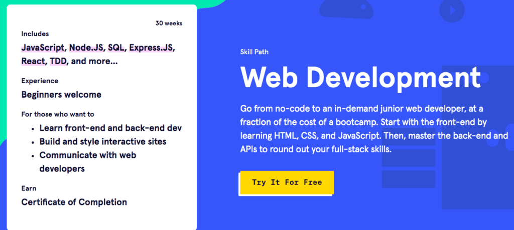
This would be my favorite course landing page of all time if they had some more proof.
But everything else here is perfect.
The headline is 10/10. And the “what you get” is ideal for this target audience. They show exactly what they’ll learn, the projects they’ll work on, the apps they can build, and the career they can expect to have after 30 weeks. It’s as legit as legit gets.
Plus they’ve got tons of great videos showing what’s inside the online course and successful students who’ve taken it.
My gut feeling is that since CodeAcademy is so popular and has tons of different courses, that the heavy lifting on social proof has been done elsewhere. Other than that, this is a killer online course lander, and you should steal this idea.
Creating a High-Converting Landing Page for Your Course Is Easy…
Just to put a bow on all this, DO NOT underestimate how important your online course sales page is. It’s literally going to make or break your sales. Do you want to convert less than 1% of visitors or 8%+? Do you want to make $1,000 from your course or $100,000?
It’s simple.
Get a great online course platform with killer templates like Kartra or use ThriveCart, choose a theme from Theme Forest, and set up a custom page on a WordPress domain. It’s a bit harder, but you’ll save a lot of money in the long run.
From there, follow this simple formula and add your favorite elements from the examples I’ve given you.
You can either succeed and grow your course to six figures or you can moan about how “nobody wants to buy courses anymore. Wah, wah, wah”.
The choice is yours.
Course Landing Pages F.A.Q.
Let’s answer some common questions you might have to help you build better landing pages.
Q: What is a landing page?
A: A landing page is a web page inside of your sales funnel designed with a specific goal like selling a product, capturing an email, or enticing a reader to click to yet another page. The difference between a landing page and other pages like a home page is that instead of just being a place for learning basic information about your company, a landing page is built with the goal of converting a customer. In online marketing, lead-capture landing pages are action-oriented. Once a customer “lands” there, you must write copy that spurs them to take action.
Q: What is a course landing page?
A: A course landing page is a landing page made specifically to sell your online course with targeted copy, strategically placed calls to action, a conversion-optimized flow, and key information about what your course offers, why the student should buy it, and the outcomes they’ll achieve with it. Key differences include having more than one CTA, the need to provide more proof, a simple design, and including benefits and emotions to convince readers to purchase.
Q: How do I create a course landing page?
A: You create a course landing page in one of two ways: you can either use a template inside of whichever course platform you’re using (like ThriveCart or Kartra) and start building from there or you can build a custom page on another website using a pre-built theme. It’s actually a lot easier than you might think. Choose a high-converting landing page site template with the elements built in already and fill in your copy according to the formula that I’ve given here.