I think you’ll agree with me when I say:
If you want high conversion rates, you need to know how to persuade people.
It doesn’t matter if you’re a B2C or a B2B company.
There’s another human in front of the screen. And if you want his attention. If you want him to engage with you. If you want him to buy your goods.
You need to understand the psychology of human behavior.
And when you know these psychological triggers, it becomes easier to get your visitors to engage with you.
With that said, here are 7 science-backed persuasion techniques that you can use right now to help increase your site’s conversions.
1. Make Your Visitors Feel They Belong
You know that warm fuzzy feeling when you know that someone gets you? That’s the feeling you want your website visitor to have when he lands on your page.
You want him to feel he’s in the right place. That he belongs there.
See.
Your typical website visitor doesn’t care about you.
What he cares about is himself.
To get him to stay, he needs to know that you have his best interests at heart.
What this boils down to, is trust. But how do you do this online? How can you transcend the cold soulless computer screen and reach out to the person in front of it?
Enter mimicry.
In Social Psychology, this is our unconscious tendency to copy the behaviors of another person. And it can do wonders in influencing decisions in your favor.
In a study by Maddux et. al., 31 students tested the value of mimicking in a mock negotiation of buying a gas station. Half of the students were told to mimic the seller. Half didn’t.
10 out of the 15 students who mimicked got the deal.
Guess how many of the other group were successful?
2!
What a big difference, huh?
But how do you mimic online when you can’t see what your visitor is doing?
This is where your knowledge of your target customer becomes useful.
Do you know him already? Do you know his pains, fears and motivations? Then here’s what you can do.
- Use exactly the same words that your potential customer uses. You can look for the terminologies in social media, customer reviews or in support emails.
- Go into Google Analytics and find the words people use to find your site
- Tap into the behaviors of their social circle. People are more likely to do something that people in their social circle also do.
2. Use Words That Move People into Action
What’s the difference between these two sentences?
- Life is a bumpy road.
- Life is a challenging road.
Two different words to describe life.
And you may think you can interchangeably use them without much impact on anything.
Well, you’re wrong.
Lacey et.al found that using the first sentence, “Life is a bumpy road,” activates the emotional part of the brain, while the word, challenging, doesn’t.
This is because when you hear texture metaphors like bumpy, your brain thinks of it as the actual experience which then triggers your somatosensory cortex.
So basically, your brain thinks you’re really going through a bumpy experience and everything else that goes with it.
What does this have to do with your site conversions?
Well, emotions are vital in any decision-making process.
So when you want to get your message across online, you want to engage a person’s emotions.
And what better way to do that than by using the right words!
Here’s something to think about:
eCommerce sites, on average, make 3-5 sales for every 100 visits.
You know how many sales brick-and-mortar shops make per hundred visitors?
20!
Why? Because their salespeople can tailor and personalize the way they sell based on the customer who walks through the door.
Which puts you at a great disadvantage as an online marketer.
And which also hones in on what I’m trying to say here:
Your copy can make or break your site’s conversions. You want to sell more? Improve your copy first.
Here are some suggestions on what you can do:
- Use sensory words. Smartblogger has a list of over 581 sensory words that you can use
- Use common words often used in your industry.
Here’s an insightful study by Birmingham City University.:
They surveyed over 68,000 eBay listings that sold. What they found was that different words affect how much a buyer is willing to pay for a product:
For example, users will pay more for a ”gents” watch (£70) than a ”men's” watch (£30) and fragrances described as ”genuine” sold for less (£21) than an ”authentic” perfume priced at £34.
See what I mean?
These are very subtle differences. But it affects how people perceive the products you sell.
That’s how powerful words are on your page.
3. Put Your Best Foot Forward
Let’s say you meet a girl for the first time over dinner. The first thing she does is pick her nose.
How do you think that will affect the rest of the evening?
The image wouldn’t leave your head, would it?
She could be funny, clever and entertaining for one whole hour. But everything she does will always be tainted by that very first impression you have of her.
That’s what you call the Primacy effect. This is your tendency to put a lot of weight on the first piece of information presented to you.
This is why first impressions matter. Be it in a job interview, a date, or in your case, the first time a visitor lands on your page.
Have a look at your site.
Imagine that it’s a person’s first visit. She has never seen your site before. What would be her first impression? Cluttered or clean? Confusing or easy to navigate? Looks a bit dodgy or looks trustworthy? Too much to read or easy to scan?
This first impression matters. It will influence what he will think about you and your business.
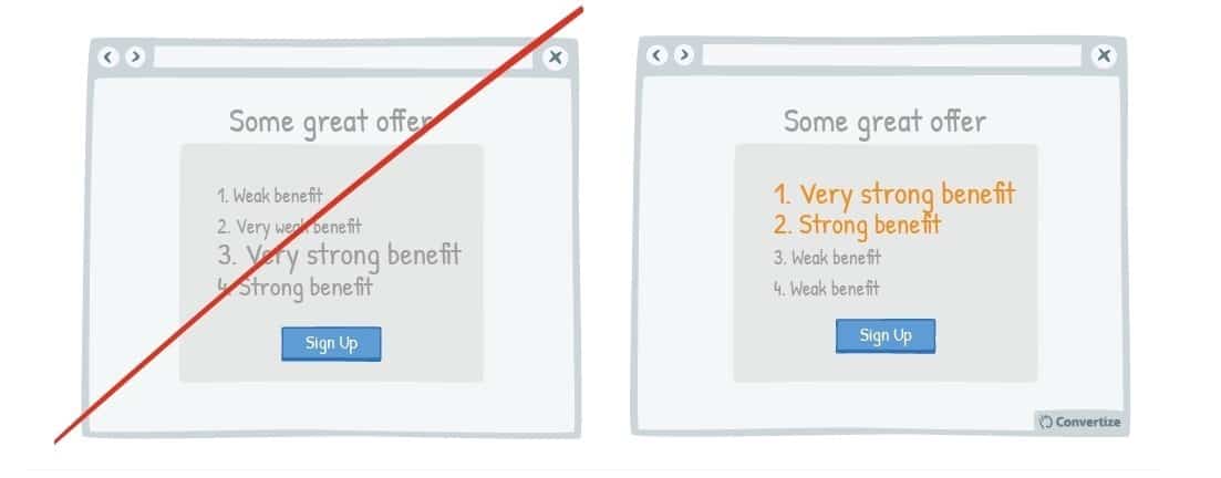
Apart from first impressions, we also rely on primacy when recalling things in a list. That is, we tend to remember things that are presented first rather than the subsequent items after it.
So when you present a list on a page, for example, start with the most important things. If you have a list of benefits on the page, put the most important benefits on top.
Like so:
4. Stay Away from Ambiguity
We thrive on certainty. The unknown makes our brain uneasy.
Certainty plants us on solid ground and puts us in our happy place.
This is just as true when people buy something online.
Your potential buyer wants to be certain he’s making the right decision and buying the right product.
So when he asks questions like:
- Will this product be exactly what it promises?
- Will it arrive on time?
- Will it fit me?
- Will I love it?
- Can I trust this company?
Then the answers should be on the page and easy for him to find.
Otherwise, he’ll leave the site and go somewhere else where he can be more certain of what he’s gonna get.
60% of 2000 consumers surveyed say that they leave a site when there isn’t enough information to help them with their purchase. They do this even when they have a high intent to buy.
Imagine your visitor.
She’s just landed on your site ready to make a purchase.
There she is. A credit card in hand.
She scans. Reads. Scrolls up. Scrolls down. Looks for more information. Can’t find what she’s looking for. Or gets overwhelmed with the many choices.
What do you think she would do?
She would start to wonder if your product is really what she needs.
Doubt starts to creep in.
And before you know it, off she goes. Off to another site that gives her more certainty.
So what should you do?
- Don’t give your visitor too many choices. This only leads to analysis paralysis. For example, when you’re building a landing page, it should only get the person to do one thing. If you must put more than one choice, on say a product page, make sure you help the visitor understand what each choice is.
- Let’s go back to what I said earlier about needing to know your customer. When you do, you’ll know exactly what questions and fears she has. You know what things would make her doubt the purchase she’s about to make. And if you truly understand her, all the answers to her questions would already be on the page.
5. Use Social Proof
“When you say it, it’s marketing. When they say it, it’s social proof” – Andy Crestodina
When a potential customer knows and sees that another person has high regard for what you’re selling, then her certainty level goes up. This makes her more likely to buy what you sell.
There are different types of social proof such as:
- Customer reviews
- Celebrity or influencer endorsements
- Brand mentions on big sites, magazines, or newspapers
- Social media shares
- Third-party certifications
But for today, let’s talk about user testimonials.
I know what you’re thinking.
“What’s there to talk about? It’s a testimonial. Every one knows every site should have one.”
But here’s what I’ve seen:
Many businesses use testimonials. But they’re not using them to their full potential.
Often, companies think that having a lot of reviews is enough incentive to influence a person to buy.
While that may be right. It’s the weakest use of reviews.
Want to boost the power of testimonials?
Then be strategic about it.
Use them to solidify your claims.
How do you do this?
Here’s what Demian Farnworth recommends in the book, “The Conversion Marketer’s Guide to Landing Page Copywriting:”
“Persuasive testimonials do at least three things. First, they mention a specific benefit your product offers. Second, they substantiate a claim you’ve made. Third, they favorably compare your product to a competitor.”
Got that?
Find reviews that fit those criteria. Then put those reviews front, right and center on your site.
6. Get Your Foot in the Door
Let’s talk Jack Reacher for a moment.
You know how it starts. First, he finds himself in a car with someone who needs a little help from him. Out of the goodness of his heart, he acquiesces. But before you know it, the request keeps getting bigger and bigger and in the height of it all, he’s breaking bones and throwing dead bodies in the river…
I know that’s a bit extreme.
But foot in the door technique (FITD) in marketing works this way without the broken bones and the dead bodies.
And usually with a happier person in the transaction.
It’s the idea that if you ask for a small request first, people are more likely to say yes to a bigger request.
We use it a lot in our daily lives and it works just as well online.
This is the concept behind a free month of Amazon Prime, behind Convertica’s offer to give you a free site audit, or a $7 ebook with an upsell.
Here’s what you need to know about FITD:
First, it’s easy to abuse it. Don’t. You’ll lose your visitor’s trust and nothing’s more deadly to a business than customers who don’t trust you.
Secondly, the small request shouldn’t be any random request. It should be related to the bigger ask. If there’s no continuity between the two, then people would begin to question your motives and will not respond to it.
The small initial ask plays an important role in this strategy’s efficacy. It should be simple but it shouldn’t be trivial. It shouldn’t be threatening. It shouldn’t make a person uneasy.
See.
If your first small ask is something that puts too much anxiety on a person, then it will decrease conversions, as Klientboost’s finds out in this test.
Here’s what they did.
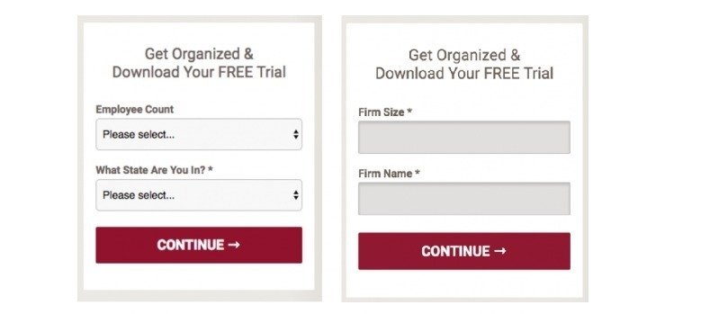
Look at the image on the right. That got a 50% decrease in conversions.
Look at it again.
Can you see what the problem is?
The second one asks for information that strips the visitor of anonymity. This makes people uneasy as shown by the decrease in conversions.
So when you use FITD on your site, remember not to ask threatening questions on the small ask and have consistency between the first and the big ask.
7. Reduce Cognitive Load
Indulge me for a moment.
Watch the video below from beginning to end. It’s less than 2 minutes long. It’s important to illustrate my next point.
Ready?
Here it is.
Your brain may be a powerful processor. But using all that power is not in its best interest.
The brain selects what’s important and decides where to focus its attention to every minute of every single day.
So when a person visits your site, he has some mental calculations to do. And there’s a limit to the amount of information his brain can process at any given time.
This is called cognitive load.
And here’s what you need to know about it.
When you’re selling to a person online, you don’t want to add too much to this load. In fact, it should be your goal to keep this to a minimum.
If possible, you don’t want the person to do any complicated mental work. You don’t want him to think too much.
Everything on your site should be intuitive and easy to do. You need to minimize stress and anxiety.
What causes this stress anyway? Here are some reasons:
- A CTA button that does not clearly say what’s going to happen when he clicks it
- A cluttered layout
- A question he can’t find the answer to
- A page with no trust signals (payment security, money-back guarantee, etc)
- The lack of shipping information
So how do you make your web page brain-friendly? Here are some things you can do now:
Don’t stray too much from standard web design. Every industry usually has a standard web layout to follow. So that when a person lands on that site, there’s not a lot of thinking to do as to what is what.
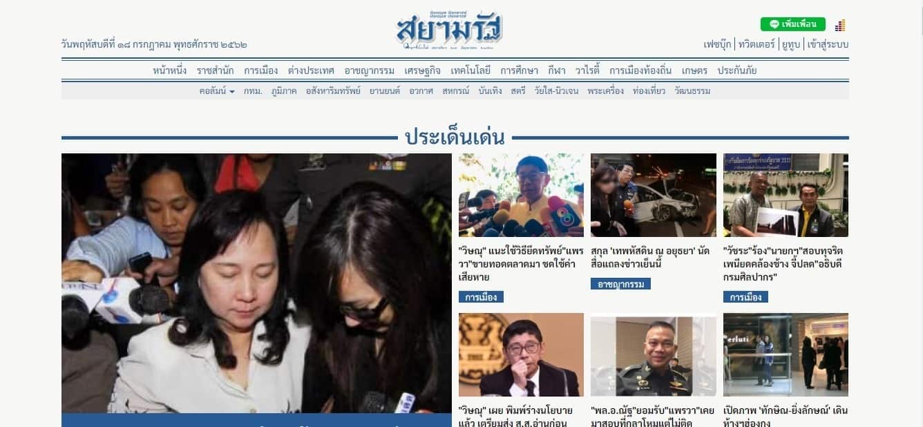
Have a look at the Thai newspaper below. Many of you don’t read Thai, but you’d have a fairly good idea where everything is. That’s because that’s the standard layout of a newspaper website.
Limit choice. Every page on your site should have a goal. Preferably just one goal.
- Your product page goal is to get the person to buy.
- Your homepage to get subscribers, or promote your new course.
- Your about page, to build trust.
Whatever it is, decide it before you build your site. And let everything on that page be geared towards fulfilling that goal. Don’t dilute it with other things. Because too many choices may just stop the person from doing what you want him to do.
So there you have it!
Seven persuasion techniques you can use for your own sites. Implement these and you’ll see your website conversions go up. Can you think of other psychological techniques to increase your site’s conversions? Let’s chat in the comments section!
About the Author:
 Hi, I’m Kurt. Founder & CEO of Convertica. I live and breathe conversion rate optimization. I hope you enjoy my findings. Interested in done for you Conversion rate optimization services? Let’s connect.