
If you’ve been doing some sort of content marketing, you must have seen various infographics.
But you might be wondering: Why do some infographics earn links, shares, and traffic so well? And why do the others get buried?
Today, I’m going to pull back the curtain and decrypt virality and show you the exact elements that cause an infographic to go viral.
All you need to do is incorporate these elements into your creative pieces, and watch them ride the viral wave. And no – I won’t be talking about good design (boring) and diligent research (yawn) here.
Let's take a look at the elements of virality.
1. Make it Trustworthy
If you have the habit of reading online (duh!), then chances are, you’ve come across a trusty infographic. A trusty infographic is simply one that makes a bold claim and backs that claim using solid data.
Take a look at this infographic by Couponofy:
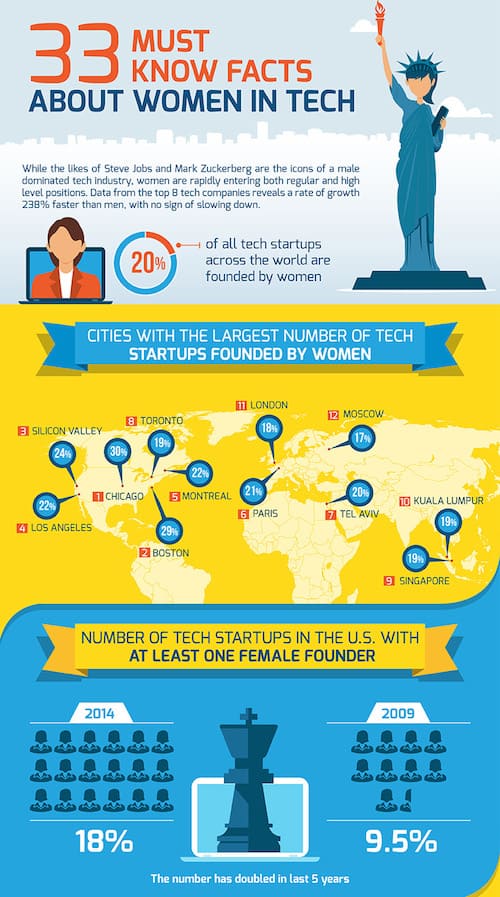
They’ve beautifully listed solid data points on the roles of females as founders, leaders and venture capitalists in tech companies to show how rate of career growth of women in the tech industry is 238% faster than that of men.
Let the data do the talk.
2. Sprinkle with Conflict
It’s obvious that this is about the differing opinions that can arise about the data your present in an infographic.
Take a look at Distilled’s famous piece on the world’s greatest vocal ranges.
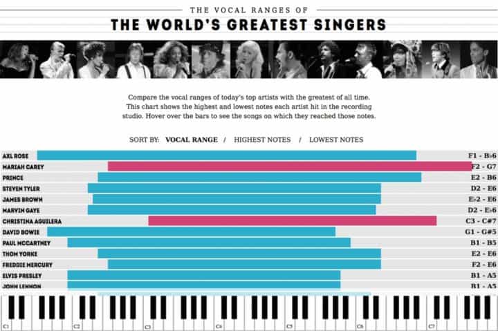
They created an interactive graphic chart that shows the highest and lowest notes each artist hit in the recording studio.
The prime factor that led to the virality of this infographic was conflict.
As the piece started gaining traction, controversy arose from a claim that Axl Rose was named the greatest vocalist of all time. This brought the initial wave of links and traffic to the infographic with a number of journalists and critics writing about it.
Shortly after this, the data nerds came along and dug out another singer with an even greater vocal range (Mike Patton). This led to another round of journalists writing about the piece. The third viral wave came from Axl Rose himself commenting on the piece.
Now, let’s decrypt it:
There are two viral waves that come when an infographic that uses the element of conflict gains traction:
- The controversy wave – This is where the critics start questioning the data points in the infographic. Most people tend to think that critics talking about an infographic is bad.
This is the best thing that can happen. It gets your infographic a lot of eyeballs, and more importantly, lots of links (which is what we’re aiming for, after all) - The data enthusiasts wave – Next, the domain experts out there start researching deeply on the data points mentioned and try to provide better or more conclusive data. Another round of traffic and links.
3. Cover an Angle
An angle is the most important factor that causes your data backed infographic to stand out. An angle is simply the central hard stat that tells a story.
In the Coupofy infographic that I used as an example above, the angle was that the career growth of women in the tech industry is 238% faster than that of men.
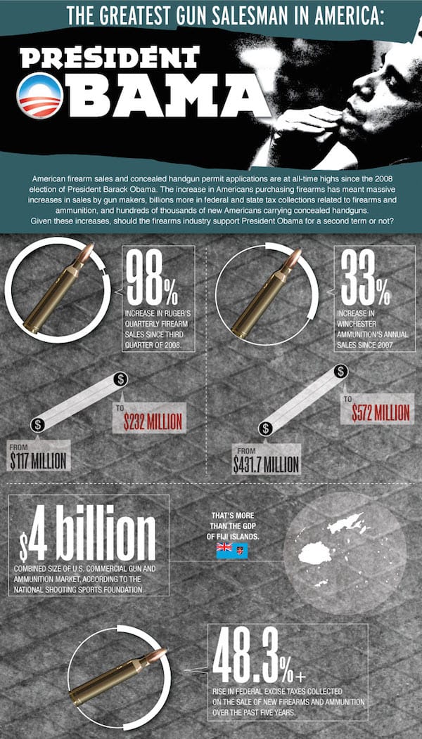
The great example of an infographic that covers an angle is The Greatest Gun Salesman in America – Obama infographic.
The central hard stat, and the angle they used is the opinion that Obama is the greatest gun salesman in America. They used the data on gun sales, ammunition sales and increase in background checks to point out that the American President sells the most guns in America.
Wicked, huh?
Let’s decrypt this one too:
This isn’t about the data or their viewpoint on Obama’s government. (To be frank, I have a neutral stance in this.) They chose an angle, and then they backed that angle with data. In this manner, they conveyed a story.
It’s all about the storytelling. But that story should be said from an angle.
Now you might be wondering: why does having an angle matter?
Unlike me, there are bloggers who like to talk about how Obama’s government wasn’t up to the mark. Your infographic gives those bloggers and journalists a chance to make themselves look good to their audience. So that they can write about the infographic, and then say – “See, I told ya!”
Note: If you take a close look at the Obama infographic example I mentioned here, you will notice that they’ve used all three elements of virality in it.
Now the most – important element:
4. Outreach and Promotion
Do you know the #1 myth prevailing in the content marketing world?
It’s this: Just produce awesome content. The traffic and links will come.
Now the truth: If you do not promote your content actively, its awesomeness is insignificant.
This is the essence of the 80/20 rule of content marketing that says: “20% of your time must be spent creating great content, and 80% must be spent promoting it”
If you do not promote your infographic, and let others know about it, it won’t take off, period. All the examples I cited above went viral because the creators took the time to manually reach out to bloggers and journalists and pitch them about the infographic.
There is a simple 4 step process you can use to outreach to bloggers and press contacts who are most likely to write about your infographic.
Step 1: Find Your Outreach Prospects
And who are our outreach prospects?
Journalists and bloggers.
And how do you find them?
Use Google!
I simply use the search operator site:domain.com “keyword,” and I use news websites like Huffington Post, Spin, Vulture, etc., as the domain.
Crazy simple, huh?
Just search for site:vulture.com “best singers,” and Google will show you all articles on best singers on Vulture.com

I list down three of the articles that have very similar topics to that of our infographic for every news website. Then it’s just a matter of listing down the names of the journalists who wrote those articles. Rinse and repeat for all news websites that publish articles in your niche.
I recommend having a 100-250 strong list.
But what about bloggers?
The main hurdle here is that some bloggers simply don’t publish infographics. So how do you find blogs that publish infographics on the similar topics?
Here’s how: Start digging on Visual.ly
Visual.ly is one of the biggest infographic directories on the web. They’ve got great infographics on almost any topic you can imagine.
Search for infographics on related topics on Visual.ly, and just download them.
Head over to Google Reverse Image Search. Simply search using each of the infographics you’ve downloaded from Visual.ly. Boom! Now good old Google pulls up all the blogs where these infographics (on topics similar to that of yours) have been published. These are the ideal bloggers that you can reach out to about your infographic.
Step 2: Find Their Email Addresses
I can jot down a huge checklist of how to do this, but Matthew Barby has done an awesome job of explaining the process here.
And a warning: this WILL be time-consuming, but I suggest you do this right.
Step 3: The Feeler
The primary reason why most outreach emails fail to prompt any action is that they ask outright what they want. But, do not ask outright. Focus on building a relationship with the blogger/journalist first.
This is the exact method I use: First, I send a ‘feeler’ email about some article they wrote, or on something that they tweeted, and I casually mention about the upcoming infographic.
Subject: [Name], I love you and your articles
Hey [First Name]!
I enjoyed your take on the recent scuffle between so and so singers at so and so awards.
And everyone on the internet is just debating on who sings better 😀
In fact, I think I should put together a creative piece on the best singers in the world (and add some fuel to the fire )
Anyway, I just wanted to reach out and let you know that I loved your piece.
Thanks and regards,
Catalin
Notice how I casually mention the infographic, and ask nothing in return?
From experience, I can tell you this: When a discussion is raging on the internet, all writers will be on the lookout for related content. When you reach out using this feeler, most prospects will just say a casual thank you and ask you to reach out to them when you’re done with the infographic.
After you’ve published the infographic, reach out to them with this (as a reply in the previous email thread):
Hey [First Name],
I just finished putting the creative piece. It was all in a jiffy, but the data and design are solid.
Here you go : www.yoursite.com/awesome-infographic
What do you think?
Thanks and regards,
Catalin
How easier can it get?
Note: Some of them might not ask you to send them the creative piece. In that case, just ask for permission to send the infographic link in your second email. And always ask for permission. You’re respecting their time that way.
Most of them, if they find your infographic interesting (which they will – you’ve used all the elements, haven’t you?) will write about your infographic and link to it.
And this is the process that most content marketers use to build traction to their creative pieces and infographics right after they’re published.
Now the bonus element (surprise!):
5. Make it an Interactive Resource
This is the final step in making your content epic. There is a disclaimer though: this is more about how you present the information that you already have using a great design.
Look at the second infographic example I showed you. They’ve done a great job presenting the data in an easy to understand and interactive visual format. When you create such interactive infographics, the content becomes a valuable and timeless resource that will drive consistent traffic to your website for years to come.
Here’s another one (I guarantee this will blow your mind) – 100 years of rock, where they’ve beautifully visualized how rock evolved over the past century and how different genres of music were born from each type.
That’s it from me. Are you ready to use data, conflict, angles, efficient outreach and interactiveness to build traction for your creative pieces? Anything that displays data visually is an infographic. What did you do to make yours stand out?
Let me know!
___________________________
Photo credit: Unsplash