Do you know what the first thing is on a website that draws your eye? And what pattern do people scan your website in?
There have been many eye-tracking studies on this subject, and I'll give you 15 most useful facts you should know.
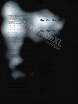
The picture below shows 3 different websites and where people look on them. Red indicates the area, where people looked the most, yellow areas got a bit less eye-action, blue areas got the least views and the gray areas, well, people didn't focus on them at all.
![]()
Almost everyone in these studies follows the “F Pattern”. As you can see, the more people scroll down, the more they lose focus and start mainly scanning your website. So always try to place the most important information in the top part of your site.
Here Are the 15 Facts You Should Know About How People View Websites
When most designers and marketers look at websites they are building, they are not behaving as the intended user of that site. They are not interested in buying; they are not interested in finding more information. They are most likely making decisions on a site filled with “lorem ipsum” based on their tastes.
DON’T DO THAT! Focus on the behavior of real people.
1. Text attracts more attention than pictures.
As much as we love photos, the fact is that the majority of people will simply scan them. If you've got a point that you actually need to get across to a reader or potential lead, you're much better off doing it via text.
2. People start viewing your website from the top left corner.
Remember that “F pattern” we showed you? That applies to virtually every single website. It's how we've been trained to search for data and information.
Make use of this by putting your most important messages in this area and try to make your value proposition clear above the fold.
3. Readers ignore banners. Surprise, surprise.
Banners convert horribly. The modern world took it a bit too far with them at some point and we've been trained to ignore them and even develop a bad taste to brands that use them.
Don't do it.
4. People only scan the lower parts of your website.
After people start scrolling down, the chances are high that they are going to be scanning and skimming your content.
To make the best use of this, make sure to use a ton of headings to summarize your key points. Make these descriptive and it'll also help with your search engine rankings.
5. Short paragraphs work better than long ones.
Our attention spans are shorter than ever and that's something you need to take into account.
No one wants to read a wall of text. Keep it short and get to the point.
6. Fancy fonts are ignored.
As “cool” as you think that font is, you're probably better off not using it. New fonts are hard for people to process and you're going to lose their already short attention.
7. Big pictures attract more attention than small ones.
If you use photos on your website or landing page, make them count. Big and bold photos will grab their attention and you'll do well by including a concrete call to action on them.
8. Headlines also draw attention.
Use as many descriptive headings as possible. This is what people use to scan through your website. Once they find something related to their problem, only then do they dig deeper.
9. Visitors spend more time looking at menus and buttons than other parts of your website.
Menus and buttons are generally what lead us to solutions to our problems. Visitors pay extra attention to these as they want to see what the options are as soon as possible.
You should do the same. Pay extra attention to what you put in your menus and how you label your call to actions.
10. Ads, that are placed on the top or left part of your website, get the most views.
Most people will never scroll down to the bottom of your website. If ad impressions or clicks are your main source of revenue, you'll want to optimize for them to be in the “viewing pattern”.
11. Ads, that are placed inside or below an awesome piece of content, get more views.
Ever get into a state of flow while reading an article and then end up on an entirely different website? The chances are high that this was a well-placed in-content ad.
If you're creating value with your article, these are often unexpected and thus get a bit more attention.
12. Lists are better at keeping your reader focused than large paragraphs.
Again, the same principle applies. No one wants to read a huge wall of text, especially if they already know a bit about a topic.
As a marketer, if I see an article about new tools I only skim through the headings to see if there's anything I haven't already heard of. The same applies in other industries. No one wants to waste time learning the same thing twice.
13. Some people even completely ignore large chunks of text.
Well, at least we know you're not one of them 🙂
14. White space is good!
If people get overwhelmed with a ton of text, there's a good chance they'll leave.
15. The menu works best when placed in the top part of your website.
A few “innovative UX designers” decided that it might be a good idea to start putting website navigation into the sidebars instead of a traditional top menu.
Well guess what. Over the last 20 years, that's not what we've been conditioned to and it doesn't work. People get confused and they leave for your competitors.'
Wrapping Up
Our friends at ConversionXL write that the F-pattern is no longer the case for search results. However it should still hold on regular content pages and it's not that much different from the original F-pattern.
5 Facts on How People View Mobile Web:
- Reader’s attention is focused more on the top left corner of a screen.
- Keep your content short & simple. Reading long paragraphs needs concentration, which is something that mobile users don't have.
- Mobile phone users absorb visuals more than text or content. (But if an image doesn’t supplement your content, you can do away with it).
- Users pay most attention on the top 2/3 of the screen.
- Short, but hard-hitting headlines draw more attention. Make your headlines count.
These principles also apply to creating high-converting landing pages. Some of the tools we use to make these include Clickfunnels as well as Leadpages, both of which we've reviewed on the site. If you'd like more options, we also have a piece with some leadpages alternatives. Check them out and pick your poison.
There you go. Some points from this list are pretty basic and elementary, but a good reminder never hurts. So the next time when you're writing an awesome piece of content or building your new website, keep these points in mind. You now have the knowledge – use it!
Sources: BBC News | directcreative | GoogleBlog
________________________
Photo via Visual hunt