The cover is really simple, just an image, but I wanted to share the idea and design principles behind a good cover image. The key features of the cover are:
Call to action
Clear call to action and the reason why they should take that action works well in this context.
Different
The landing page and profile picture go hand in hand, and this will catch visitor's attention a little more than a normal picture. Think outside the box.
Interaction
The cover image on has to intrigue and make people ask what's that?
Personal touch
People like people, not companies, so, try to use real people in your images.
Beauty
Before anything else, people look at the visual appeal of the Facebook cover image. Make your Facebook page stand out, and visitors will stay long enough to get to the message.
Need more inspitation? Check this post for landing page examples: 22 Inspiring Examples of Facebook Page Designs. If you need tools to create a Facebook landing page check here 4 Free Facebook Landing Page Creation Tools. Find out how you can set up a custom facebook landing page.
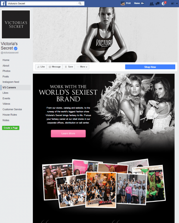
Victoria's Secret
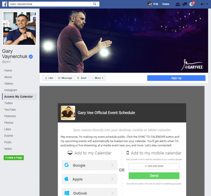
Gary Vaynerchuk
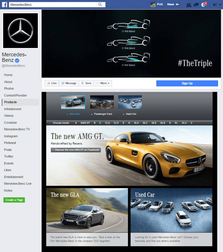
Mercedes-Benz
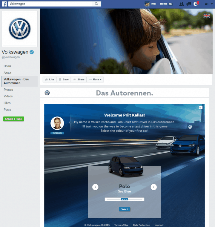
VW
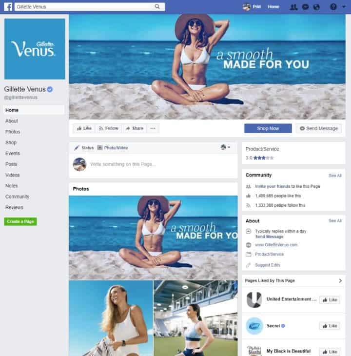
Gillette Venus
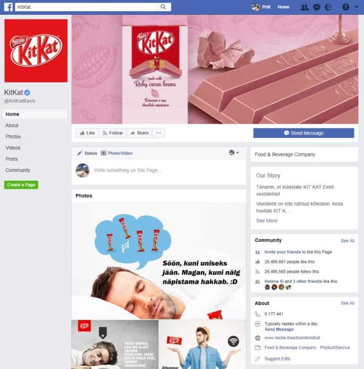
Kit Kat
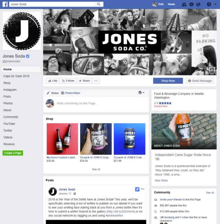
Jones Soda
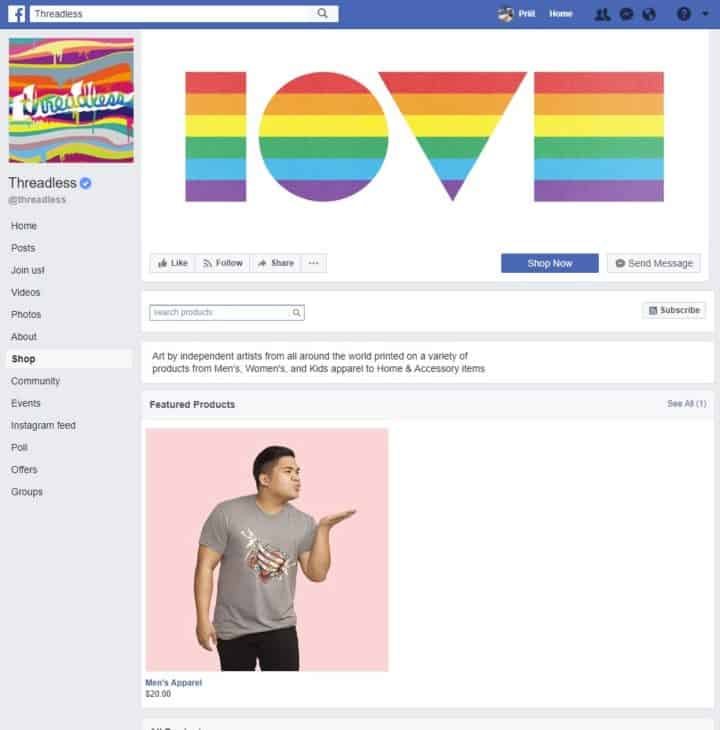
Threadless
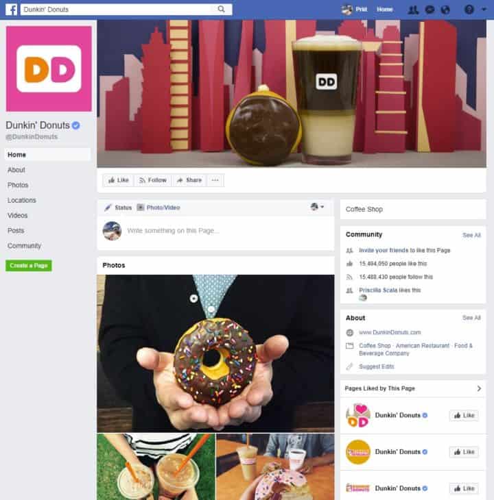
Dunkin' Donuts
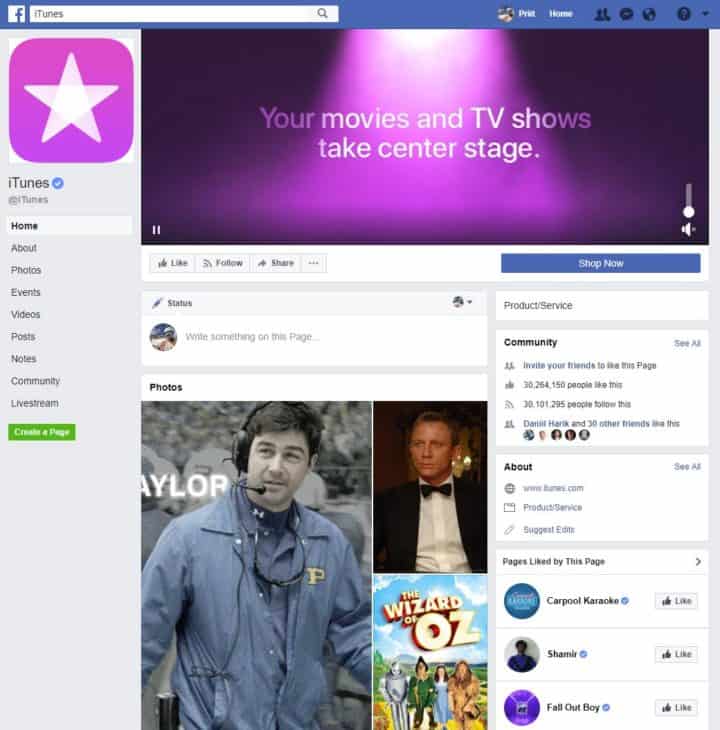
iTunes
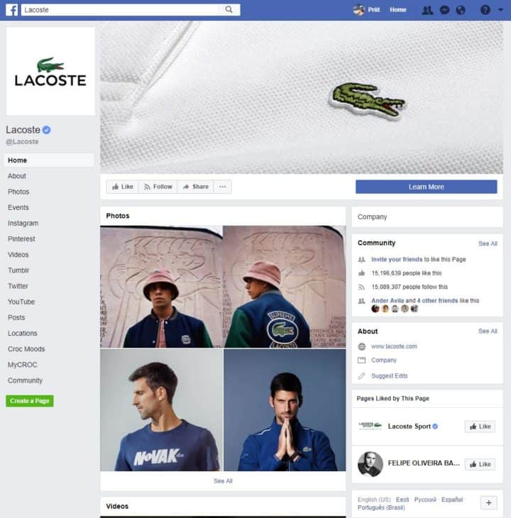
Lacoste
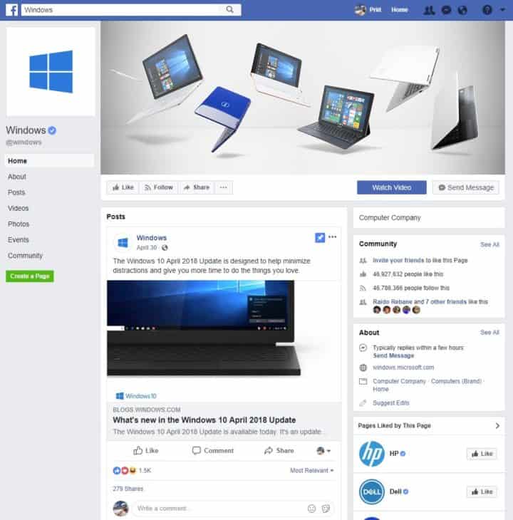
Windows
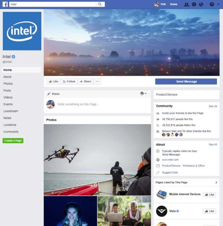
Intel
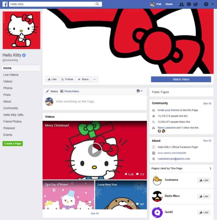
Hello Kitty
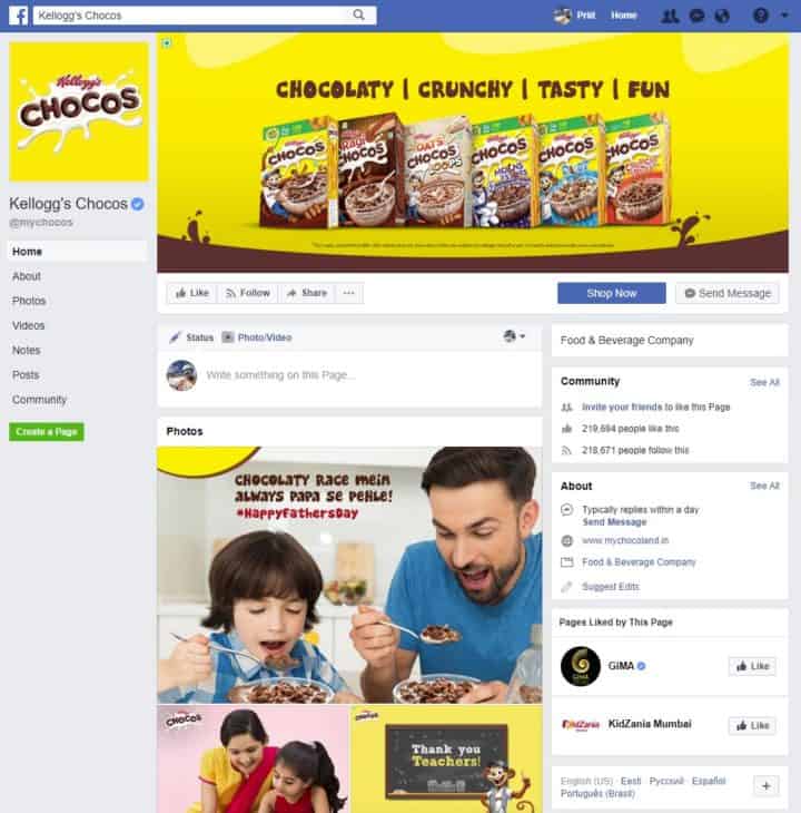
Kellogg's Chocos
Take a look at Facebook cheat sheet sizes and dimensions
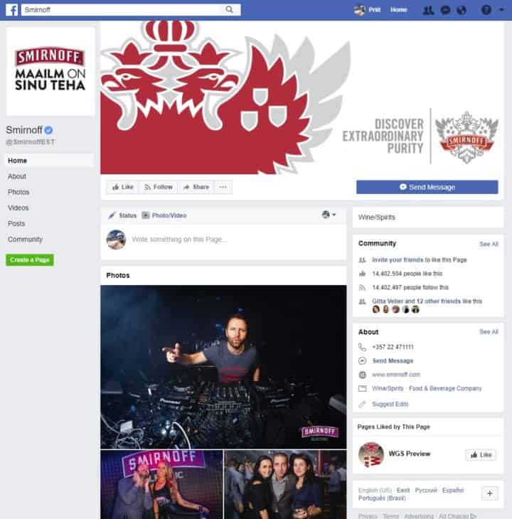
Smirnoff
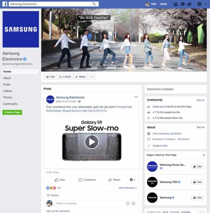
Samsung
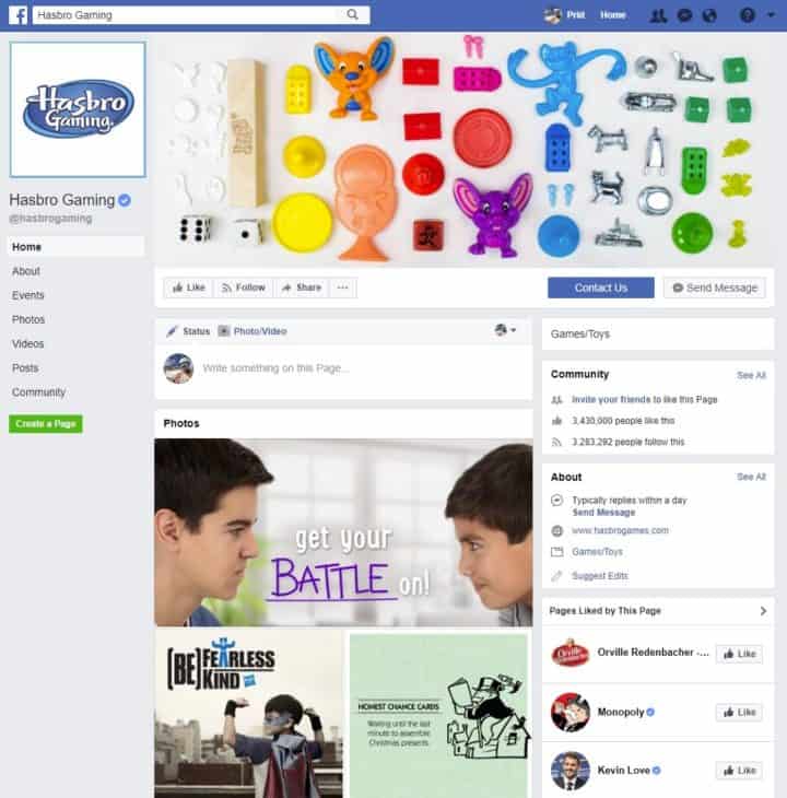
Hasbro Gaming
Sprite
![]()
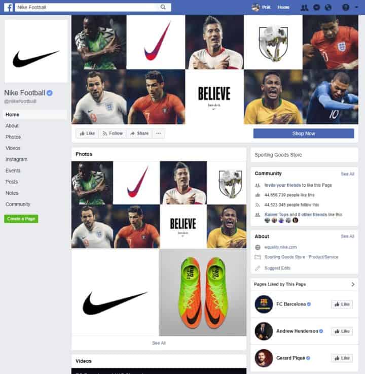
Nike Football
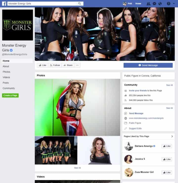
Monster Energy Girls
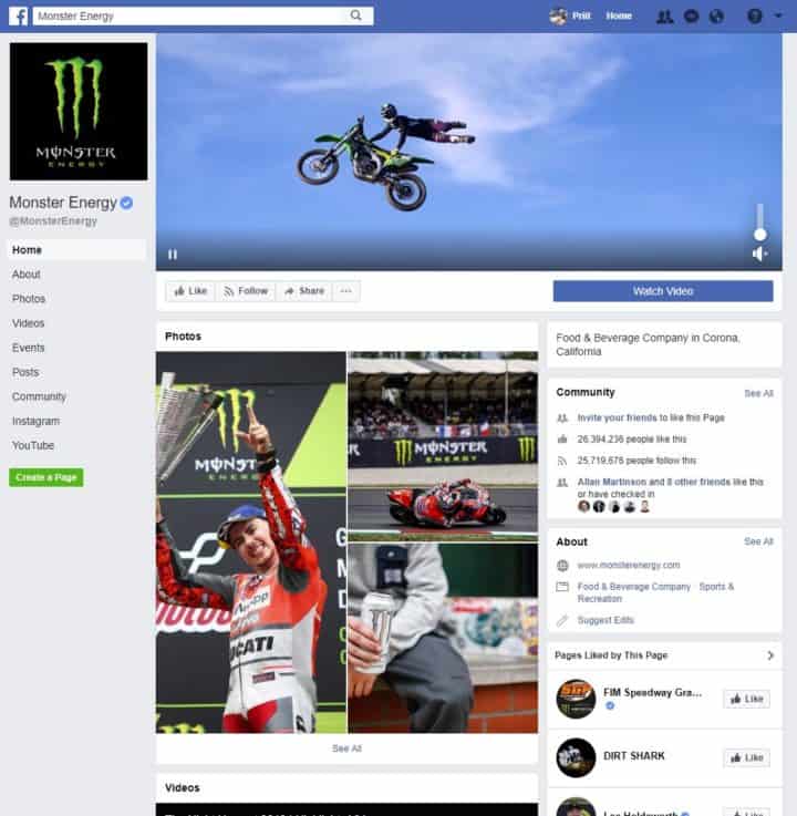
Monster Energy
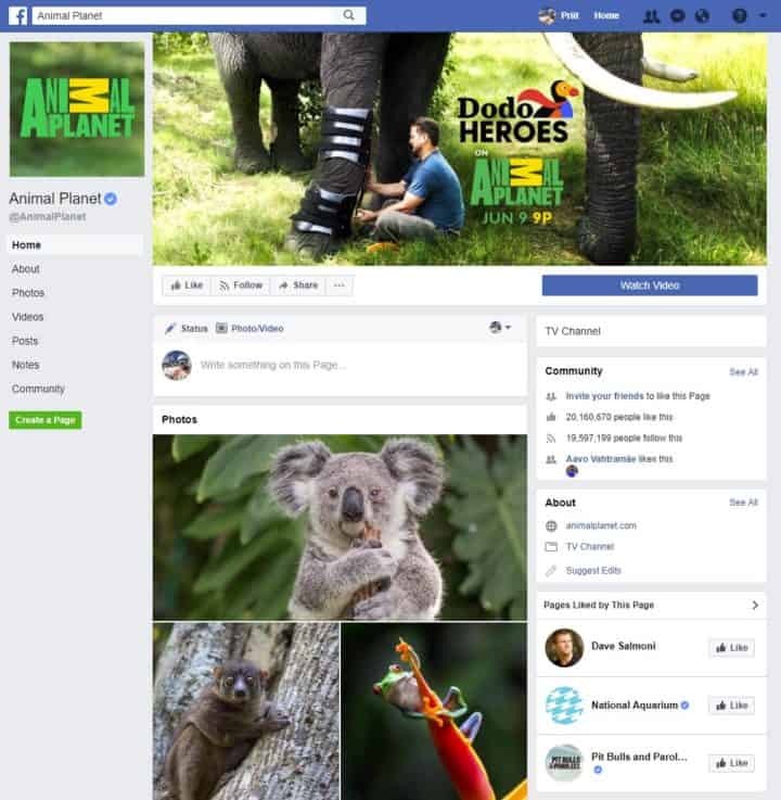
Animal Planet
If you know of any really cool Facebook welcome page examples, please add them to the comments.
P.S. Social media is cool and all but what are the landing pages on your site looking like? We've recently reviewed Leadpages and Clickfunnels, two of the most popular landing page tools out there. Give them a read and see how you can integrate them to your marketing and funnels. For more options, check out this guide with some alternatives.